A menu on a website is a list of links that lead to other web pages. These can be either internal or external, although the former is more common. Typically, menus appear above the fold, but they can be found on different sections of a page, depending on the layout. These allow visitors to orient themselves and access other important or relevant pages on a website with a single click.
One the most utilized tools for navigation, a website menu is especially helpful to brands with varied products. It features categories or related links that enable users to navigate the site and find what they are looking for. In most cases, the search bar is placed within or beside it as both serve the same purpose of supporting shoppers’ on-site search and navigation experience.
Menus are akin to shelves that display products according to categories in brick-and-mortar stores.
The following kinds of menu are used depending on a brand’s goals and general layout:
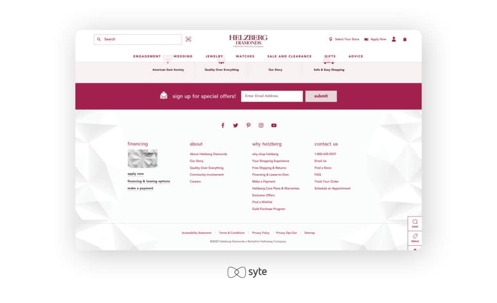
- Classic. The menu is located on the website’s header, usually in a horizontal manner, and the pages are listed side-by-side. This is the most utilized kind of menu on websites.
- Dropdown. For dropdown menus, links will appear once a user clicks or hovers on a menu item. This type is great for sites that are rich in product and content.
- Footer. Menus on the bottom of the page often complement the classic header. Other important links that are more about the brand than its products can often be found on a footer menu.
- Hamburger. Often used in mobile sites, hamburger menus are indicated by an icon of three horizontal stripes. Tapping or clicking on the icon will open a menu with links. This is ideal for pages where there is limited real estate.
- Sidebar. The items are listed vertically on either the left or right side of a page. This type allows for longer links and more important options.
- Sticky. This kind of menu floats on the screen even as visitors scroll down your website.
Best Practices
Here are some of the ways to better utilize website menus:
- Only add options that have value. You do not have to fill menus with all the possible links. Going overboard with your options can easily overwhelm a user and make the menu look less intuitive.
- Don’t be afraid to use images. Images can catch your visitors’ attention and make navigating through various categories easier.
- Take every screen size into consideration in your design. Many shoppers browse through their mobile devices. Considering the size will help you narrow down the most important options that should be visible on the menu.