Ecommerce UX has been slow to evolve. While webpages may look a little slicker and a little more high-res than at the dawn of ecommerce, not much else has changed. Basic text search, a basic hamburger or sidebar menu, and some product photos were the order of the day. And customers put up with it because that’s all that ecommerce providers gave them.
Well, until visual search for ecommerce hit the market.
Visual search for ecommerce is more than a single feature to add to your website — it’s a driver of good website UX. It can transform the functionality of your site to better appeal to customers across devices and make the user journey easier.
And good UX means shoppers staying on your site, returning to your site, and converting on your site. As visual search for ecommerce comes up on more and more sites, customers will come to expect it.
Visual search for ecommerce drives streamlined design
Ecommerce websites are a labyrinth of items, photos, descriptions, and potential user paths. Their design can be difficult because you want to both display your product and make user paths easy to navigate without overloading the user with a mishmash of products and pushes. They need a clear navigation from the homepage and an intuitive user interface.
Take this Forever21 homepage, which has an animated rotating cover image, and its mobile website counterpart:
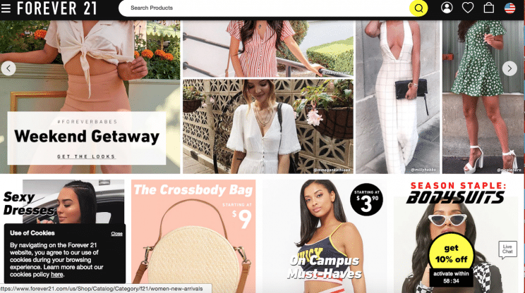
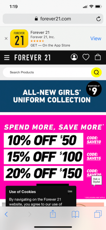
Pop-ups, app downloads, an “ask a stylist” button, a 10%-off activation with a timer, a text search, a tiny hamburger menu, and a banner pushing a promotion are just too much to throw at a consumer who is trying to get around an ecommerce site.
One thing that consumers respond to is a clear call to action (CTA), but ecommerce websites like Forever21’s are often flooded with them. Should we Shop Now, Shop Sale, Shop Women’s, Shop Men’s, Shop Gifts for Her, Shop Bestsellers — the plethora of calls to action can confuse customers who are unsure of what path is best for finding what they’re shopping for.
But when your CTA is “upload image to shop,” that’s a clear indicator of what a customer should do. You can still plug sales and special offers, but you don’t need to clutter your homepage with an endless scroll of sections and a menu with subsection after subsection.
Tooltips are also a great way to prompt users to find their own paths without causing an up-front sensory overload. A tooltip to introduce users to visual search or prompt them to shop the homepage look pulls casual customers into your website.
 Intu uses a clean white background and a tooltip on the top of their homepage to direct users to a photo search.
Simplicity appeals to all of us, and visual search gives shoppers the ease of instant results without a cluttered homepage to click through or menu after submenu to find the categories we want. It takes out unnecessary steps in the user journey and pulls customers in with a more streamlined approach.
Visuals in ecommerce shape user experience
Visuals are a key component in any ecommerce strategy. On a website, customers don’t get to play around with or try on products as they would in-store. Experts agree that videos, gifs, and still images shape the ecommerce customer experience — and they can make the difference between purchasing and bouncing off of the site.
But they’re also a difficult beast to tackle for customers. They need to see the products, but they can’t always find what they need to see. Text search has proved inadequate in connecting customers with the items they’re looking for, because describing the images they so desperately want to see is much harder than it seems.
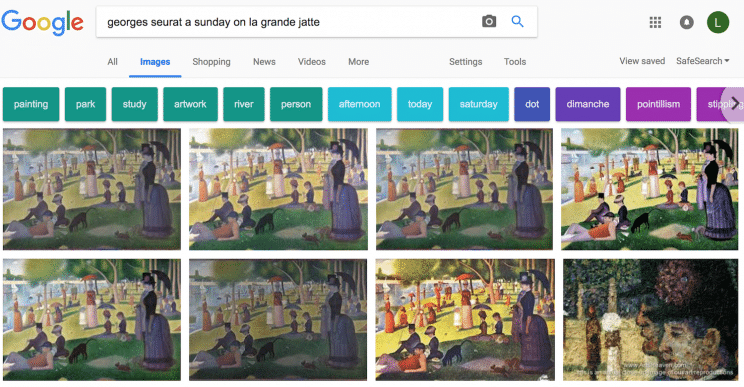
Try it yourself — think about a famous painting. Now, how would you describe it if you didn’t know the artist and were trying to search for the artwork online? If, for example, you search for “big painting river people blurry,” the results you get are:
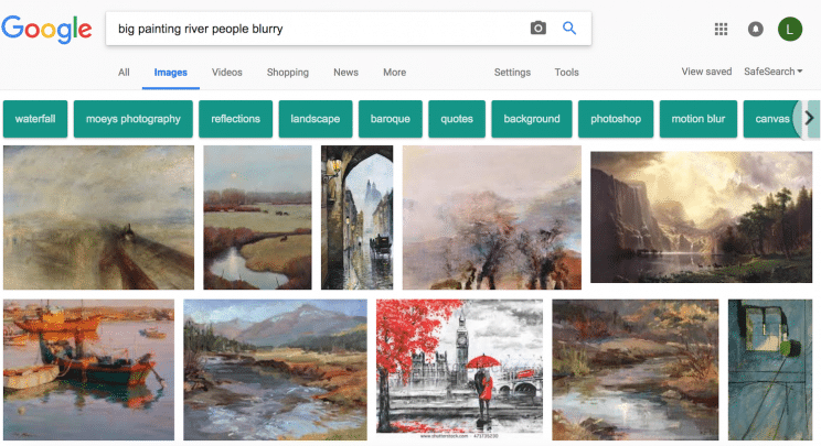
This is not a bad query — it has painting size, technique, and two defining features of the painting. And all of the results are technically accurate. But none of them hit the mark if you’re actually looking for:
This same principle holds when you search on an ecommerce website. If you’re looking for a particular sofa or a certain color of shirt, it’s often not enough to type in a description. Take this query for women’s blouse with a filter for red that contains a polo, an orange shirt, and a multicolored pattern:
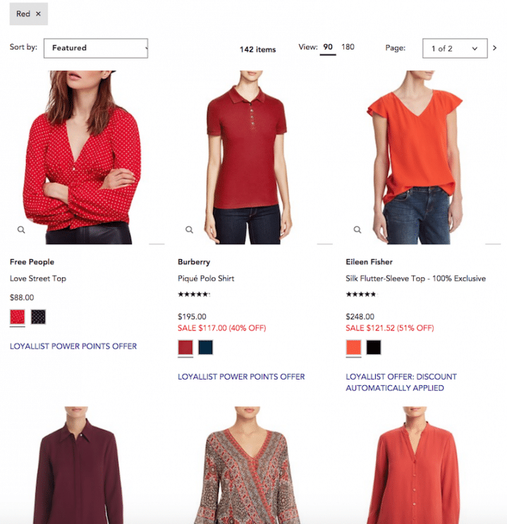
After looking through 147 options for one item, fatigue sets in, and customers get frustrated that they can’t find exactly what they’re looking for, or know it’s not on your site. Those product photos, so crucially important to ecommerce sales, become a huge source of frustration. Customers know what they want to see, they just can’t bring it up with their search: big painting river people blurry syndrome!
Visual search for ecommerce uses ecommerce’s most powerful tool — visuals — and then removes their negatives. With visual search, you see it and you can immediately shop it, whether that’s finding look-alikes when you browse your favorite items or uploading a photo of the perfect party dress.
Visual search enables superior mobile UX
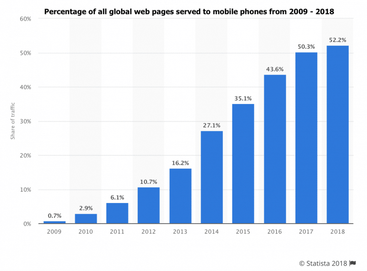
Mobile is growing, and it’s probably going to keep growing. More than 50% of web pages are now served on mobile, and that’s a historical trend that has only gone up.
 [Source]
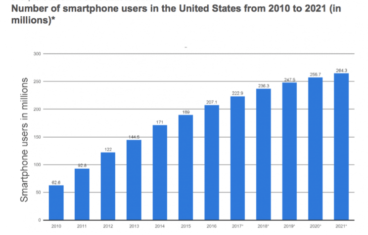
Not only is traffic on mobile going up as an overall percentage of web use, but smartphone users are projected to rise by 201.7 million from 2010 to 2021 as well. And as those consumers become used to using their smartphones for everything from a video camera to a plane ticket, they’re going to expect a great mobile experience.
 [Source]
So why do so many ecommerce sites have clunky, hard-to-navigate mobile sites?
A big part of the reason is that labyrinth of content that is on an ecommerce website. Pages and pages of products grouped by different attributes need to be made available to users. Which makes mobile sites the perfect candidates for visual search.
Visual search for ecommerce fits on mobile phones because
- users store hundreds of photos on their phones;
- smartphones can all instantly capture a look or an item to upload with no effort;
- phone apps, such as Instagram, are heavily image-based and lend themselves easily to screenshots; and
- mobile users want to swipe and tap, not type long text strings.
When visual search is introduced, they can navigate an ecommerce site easily from their mobile phone using pictures they already have on it, without having to type out queries.
And, just as important, it immediately gets users to cut into the heart of their search in a way that saves them valuable loading time. How long it takes for a site or an image to load on mobile has a big effect on whether people convert — and whether they even stay on the site.
With visual search for ecommerce, you navigate users only to the items they’re looking for, not to a category that’s a nesting doll of other categories that leads to the item they want. This means you aren’t asking users to wait around while heavy homepages or dozens of results they’re not interested in load. Their user experience is streamlined, and fast.
Good UX is easier than you think
While website redesigns and overhauls of navigation systems may be a necessary part of a spectacular ecommerce UX, they’re not the be-all and end-all of good UX implementation. When you implement visual search, you can immediately revolutionize the way that your customers are interacting with your site, allowing you to appeal to them better on every level.
And we do mean immediately — Syte can implement a visual search for ecommerce in 24 hours. Sounds good? Contact us today.Visual Search for Ecommerce’s Hidden Upside: UX