To compete in ecommerce, product recommendations are standard nowadays. Suggesting you add a personal product recommendation is not a surprising piece of advice. But what is surprising is that the ecommerce industry has focused more on the tech behind product recommendations than on the best practices for integrating them.
We’re huge fans of algorithmic touches, great tech, and AI in ecommerce, and knowing what’s going on under the hood is important. But to nail product recommendations, you need to think of them as an integral part of the shopper’s journey. Just as important as how you recommend is when and where you offer that recommendation.
Homepage and website entrance best practices
Your website homepage is a difficult place to offer customization, especially for new shoppers or users who aren’t logged in or are accessing from a public device. But if you don’t try to customize your homepage, you are missing out on a crucial step of the user journey. A well-curated homepage will lure shoppers in and get them thinking about your inventory.
Recommend products for buyer personas
For brands with a strong user persona, designing your homepage to hit user personas is a great way to offer low-stakes “personalization.” While that might not work for marketplace sites that sell a huge amount of inventory from many different retailers, single-brand websites are a perfect fit.
Take J.Crew, an American brand with a very strong aesthetic. Their shopper is willing to spend, wants classic cuts without flash, but is likely to update their wardrobe with the season. To appeal to their core female shopper persona, J.Crew gives their “best sellers” in seasonal-appropriate outfits with a click-through on any outfit:
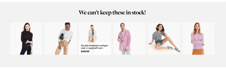
They also embrace seasonal trends. We’d guess from the J.Crew homepage that coats are a big seller in the fall/winter because they’re the customized lead on the homepage, but note that the company is clearly catering to buyer personas on the page’s side scroll. The woman looking for holiday dresses, the “quirky-cool” shopper looking for accessories, and the shopper looking for utility pants are all well represented:
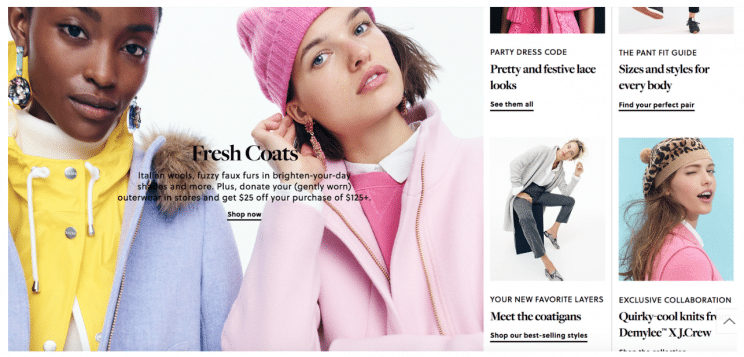
The only way we think J.Crew could make their homepage recommendations better is by adding a shop-the-look feature. Instead of just showing these women in coats and hats, what if the user could click on the coat or accessory in that image and immediately see similar shopping options? The shop-the-look feature is a great way to pull users into the site, based on their personal taste.
Allow for “manual” customization of recommendations
Another route for ecommerce homepage recommendations is to let the user customize their recommendations.
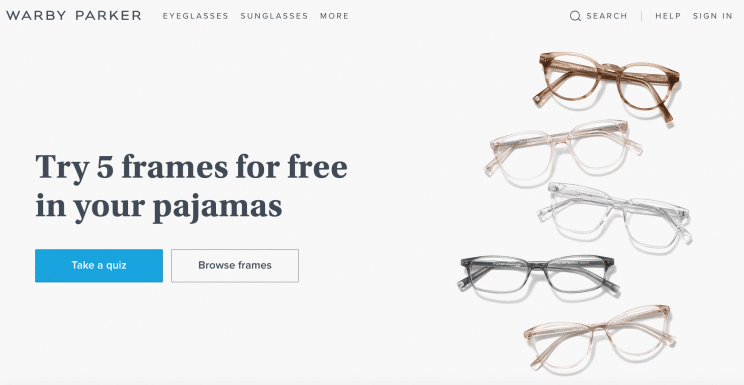
One way to do this is with a quiz, like Warby Parker does. The eyewear brand knows that glasses are very individual things, so offering recommendations is difficult. When you open up their homepage, instead of seeing a ton of inventory, you’re invited to customize what you’ll see by first taking a quiz:
At the end of the quiz, you’re given options that fit your specifications:
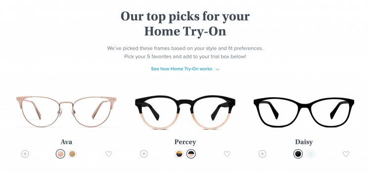
This serves two purposes. One, it allows you to build custom recommendations for any person who comes to your website, drawing them in with a value proposition. Two, it begins the shopper’s journey with an assurance that your site is geared toward helping them find their best fit.
You can even get creative with manual suggestions. Take ecommerce darling Glossier’s approach. The skincare and makeup brand knows that finding the right cosmetics products can be difficult. What works for dry skin doesn’t work for oily skin; what works for a hardcore makeup addict is overkill for a makeup newbie. Instead of a quiz, Glossier personalizes by placing different routines front and center:
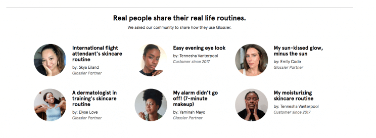
Instead of “shop the look,” this is “shop the beauty routine.” Anyone who checks out Glossier’s homepage can easily shop makeup looks or skin products that fit their aesthetic and skin type through these “routines.” Glossier can’t recommend a product for everyone on the homepage, but they can get you to find personalized recommendations.
Product recommendations for product pages and checkout
Unlike a homepage, product and checkout pages are places where the user has already given you some information about what they like, even if they’re a first-time shopper. Use this to your advantage to recommend products that fit with their purchase intent at the very moment they’re shopping.
“People who liked this also liked . . .”
When a shopper is on a product page, they’re interested enough in the product to want more details. If they don’t find it exactly to their liking, they will click away and continue to search. If they love it, they may try to find items that go well with it. If they’re at checkout, they’re almost ready to pull the trigger and are looking over their cart to make sure they’re satisfied.
That’s why using AI to drive “people who liked this also liked . . .” is a great choice. By using image technology to offer similar items to the one you know a shopper is interested in, you’re extending their journey based on what they already like. It builds in opportunity for shoppers to compare or continue browsing right from the product or checkout page, using social proof to give an edge to the recommendations.
Take Patagonia’s similar product example from a navy and gold hooded vest. They give two other similar options, and also direct customers easily to the women’s clothing section if neither option strikes their fancy:
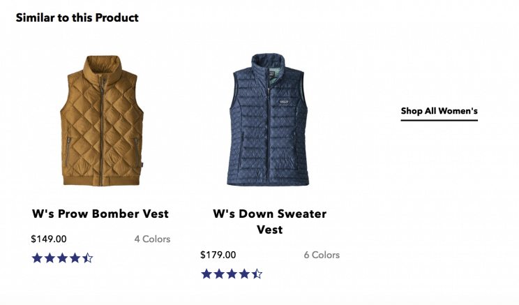
That’s way easier for shoppers looking to continue their journey than clicking back to a search and then navigating to another category, and it drives consumers deeper into your site. If a consumer is unsure of an item at checkout, they can easily swap it out.
“Similar items” feature
A “similar items” feature is a great way to add to product search and product recommendation pages, especially for marketplace sites that aggregate many brands into one ecommerce store.
The similar items feature pushes a customer to compare and drives them deeper into one section. People who are still on the search page (or a product page) haven’t decided that they are definitely completing a purchase yet. So why not show them similar options to whet their appetite and get them thinking about the best deal or the perfect version of what they want?
Take Intu’s “personal items” feature, which personalizes recommendations for anyone, even first-time shoppers, based off of what appears in search. If a customer presses the “quick shop” option, they can instantly see similar items:
The search page is a pivotal point in a shopper’s journey. When they see an item they like, it means they’re ready to dive deeper into your site and move forward with their purchase. Offering recommendations at this point facilitates that part of their journey.
Postpurchase or purchase nudge recommendations
Postpurchase and purchase nudge often happen through email. While one involves reaching a customer who has already bought, and the other involves reaching a customer who has abandoned their cart, the intention is very similar: trying to get customers to come back and spend.
Use purchase nudges to suggest new recommendations
When a customer has left their cart, they’re doing it for a reason. If that reason is that they wanted to comparison shop or they weren’t quite satisfied with the item that they saw on your site, adding new recommendations based on what they had in their cart is a great way to nudge them back.
Take Sephora’s example. Their nudge email leads with the products left in-cart — in this case, two highlighting products:
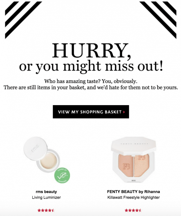
Then, they follow up with similar recommendations. They include Fenty products, like the one abandoned, but different formulas. They also include two other four-and-a-half star items, both of which have a similar feel to the highlighters abandoned, but one is much more shimmery and gold, and the other looks to verge more on a bronzer:
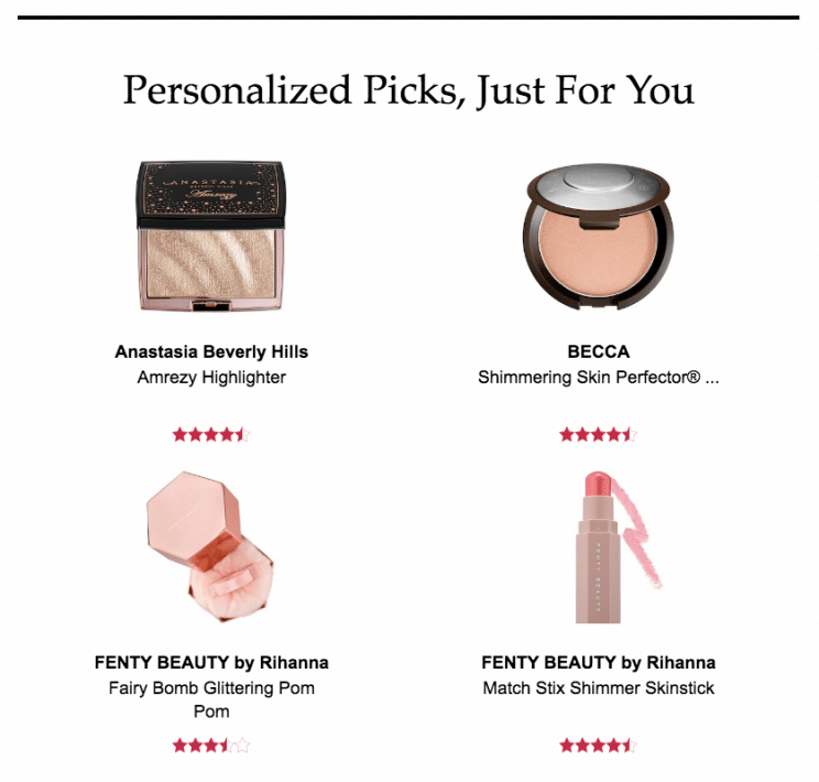
Why is that important? Because they’re solving for a problem in the customer journey. If the person who abandoned this shopping cart wasn’t convinced by their choices, showing them variations can pull them back in to browse for that perfect item. Going off of similar shoppers’ purchases, best sellers — that doesn’t matter as much as why you’re offering new recommendations in an email.
Time to repurchase . . . so why not throw in something new?
When you’re trying to get shoppers back to repurchase from your site, you can definitely plug items that a shopper has already purchased, especially if they’re items that run out. Toothpaste, grocery items, and beauty products are prime for repurchasing.
But if you can’t push repurchase (say, a sofa) you can still nudge to repurchase from your site by suggesting things that are similar purchases or items that fit the aesthetic (a table lamp to match the couch). MeUndies suggests a similar purchase in their follow-up email and pulls the user in with the CTA “check availability” :
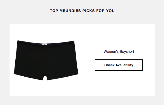
Adding similar items and purchase recommendations in a repurchase situation is about drawing people back to your site, so this CTA is a great touch. If you are an ecommerce retailer with a loyalty or rewards program, use similar items in the same way you would for a repurchase email. With repeat customers, you have a wealth of items to work from to offer similar styles that will entice them. In fact, loyalty reward program experts Antavo point to personalization as a key part of a successful program.
The customer is always right . . .
So why not personalize for them? If you are interested in adding a “similar items” shopper like Intu’s or a shop-the-look feature, contact Syte to see how we can help you add the perfect recommendation to the right part of the user journey.