In the tech world, people want to use psychology to hack everything — onboarding, email titles, Facebook ads, you name it. And website design is certainly not immune to this trend, especially when it comes to something called scanning patterns.
But myths of their efficacy were greatly exaggerated — something that we’ve talked about before. As researchers went deeper into eye scanning patterns over different sites and different devices, they found that the patterns pushed by early discovery weren’t as ubiquitous as they seemed. Screen size, photos, video thumbnails, font sizes and user intent all shape the way that people interact with content on the web.
What that means for businesses — especially e-commerce vendors — is that optimizing website design is about more than just hacking the way our eyes move. It’s about understanding how users interact with the content you have and marrying that with what you want them to do.
Whether you’re on a first-time design or your hundredth redesign, refocusing your website’s layout to cater to the needs of your readers and customers is more valuable than following any prescribed scanning pattern.
Z and F Layouts: Truths and Myths
Scanning patterns are allegedly how people “look” at web pages, and they were supposed to be the keys to designing content that was optimized for how people absorbed content. The most talked-about scanning patterns are Z- and F- layouts. These two general shapes are shown in studies to correspond to how people were picking up information online.
 Sites across the web latched on to f and z scanning patterns as gospel truth.
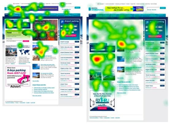
The Z-layout tended to be the scanning pattern for landing pages, wherein a viewer would start at the top left, usually where a company logo or anchor text is. Then, they would scan along the header to the right corner, cut across the screen and scan along the bottom, usually where a call to action is.
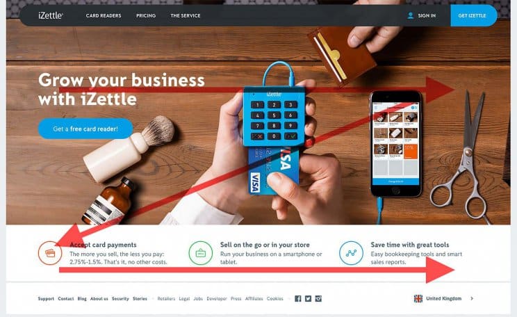
Here, we can see that iZettle has designed their landing page to centralize basic info (company name, anchor text) on the upper left and follows their customer’s eye with more info on the bottom. The one thing they probably should have done to “optimize” the Z-pattern is move that blue “Get iZettle” button to the bottom right.
When you look at landing pages like this one, it’s easy to see how it’s arranged to follow this eye pattern. Viewers are picking up visual cues, which reinforce the prevalence of layouts like this.
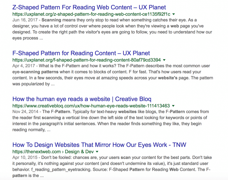
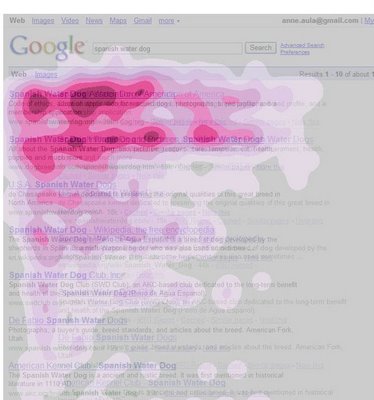
The F-pattern website design is widely used in an area even more prevalent than landing pages: search. In the F-pattern, the eye primarily scans down on the left, with a couple of sweeps to the right. This Google search shows a clear “F”-shape in its eye tracking, and a blog page shows a similar, although weaker, F-shape as well:
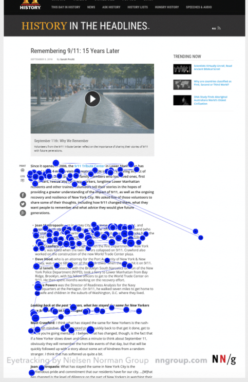
But the kicker on F-page studies, like the widely cited study by the Nielsen Norman Group, is that they don’t definitively assert that F-scanning was the only, the best, or even the most prevalent scanning patterns. In fact, the Nielsen group itself says “[t]he F-pattern is negative for users and businesses,” and “[g]ood design can prevent F-shape scanning.”
Yes, people do scan websites in Z- and F-patterns, and yes people have really taken that and run with it, from a design perspective. But to design for these patterns isn’t the way to go about things. Instead, you need to design the experience for your users and what they’re trying to accomplish on your site.
No magic layout: designing for task scanning
That means thinking about task scanning. Task scanning is the idea that people interact with websites differently based on what they’re trying to do. So rather than try and arrange elements based on a specific scanning shape, you make it as easy as possible for people to accomplish their tasks:
- Return browsers who are looking for new items and are likely to use CTAs
- First-time browsers who want easy, categorical navigation
- Viewers seeking specific information, like returns or contact info
This is especially important for e-commerce sites. On someone’s website or blog, there might be a few pages such as Home, About, Blog, Contact; navigation is simple and options are limited. But when you’re showcasing products, there are a lot more variables. One person wants a specific outdoor gear item, another wants shipping FAQs, and yet another is trying to browse the clearance section.
This means that an e-commerce landing page needs to be more organized than a single-product page, which might take that Z-formation. E-commerce sites need to rely on menus and clearly labeled subsections. The most popular options are menus on the top, and menus that are left-aligned:
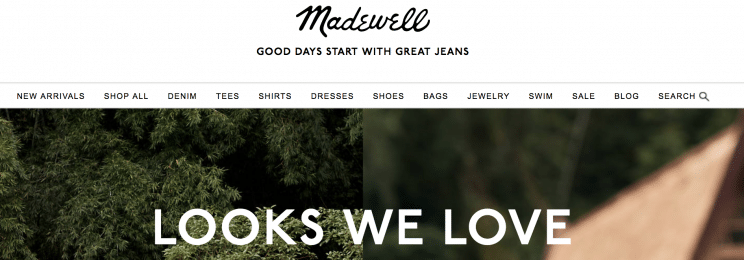 Madewell places categories on top and asks users to click on them for more. They keep their home page mostly text-free and image heavy, without designating clear pathways to get to shopping those products other than the top bar. This keeps things simple for visitors, but wastes some of the potential for the front page.
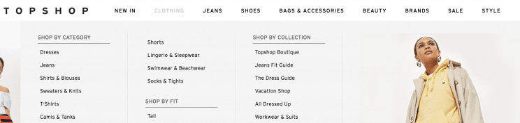 Topshop gives categories that reveal subcategories in a drop-down menu to the left. This is a much quicker navigation scheme than Madewell, and they need it — their home page has no products on it. Instead, they plug shopping a collection, reading the blog, or viewing the gallery. All shopping navigation goes through the categories. This is better than Madewell’s confusing front page; it offers the pure utility of shopping by category for task scanners.
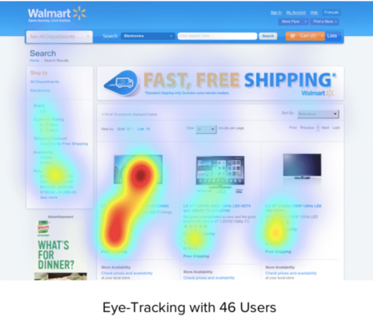
Amazon gives a left-aligned menu once a user has navigated to a subsection, and then supplement it with a series of product photos with links but no descriptions underneath. Because of the enormity of Amazon’s product catalog, it’s a good choice to get shoppers into a narrower category before offering a page with a subsections menu. Their approach screams utility and lacks the style of Madewell or Topshop, but their product selection is enormous, so task shoppers want to browse by category through their menus, not casually click through inventory.
Adding any of the menu options above is an easy and obvious way of helping people immediately find what they’re looking for. Shoppers know that the top bar is usually where to find categorical information for items, and they’ll quickly scan to find what they’re after and proceed from there. Website scanners are drawn to these menu features.
But once users start shopping, you need to think about other elements beyond basic navigation and how they aid or impede a shopper’s journey. That means turning a close eye to those things that we know will grab the attention of people skimming websites.
Shaping your own narrative: attention grabbers
What determines viewer scanning patterns as much as what they’re looking for is how you arrange elements on a page. Some things will naturally divert the flow of a reader’s attention.
Visuals
Visuals are a big draw for website browsers, especially if they’re shopping for products. While people will read descriptions and other text, feature images of products stand out to the eye. However, if you’re just using a header image, that’s actually not a huge draw. So what matters to shoppers isn’t a banner image that you choose, but the product images you display:
 Website viewers gravitate towards images.
For shoppers, this means that if they see an image of what they like, they’ll zoom right in on it. Image search is a great way to take advantage of this, because it directs a viewer’s attention to what they want to focus on. It eliminates extra steps of browsing through text and selection options when the eye is clearly drawn to visuals. FASHIONLOVER, an online magazine, displays this on their home page as they offer shopping using only images on their home page:
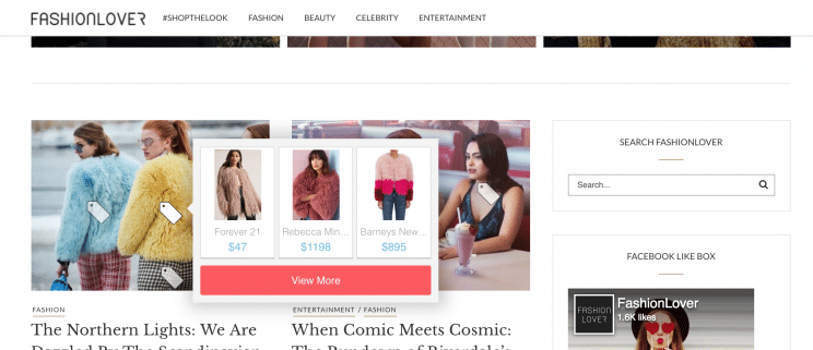
This lets users browse for items they gravitate towards and then find them without putting in any search terms and without even clicking away from the home page. For someone who is browsing a fashion magazine for sartorial advice with intent to shop, this is a great feature — especially because it doesn’t obscure the layout or detract from those coming simply to read articles.
Headers and text breaks
For any pages with text, like a home page or a special sale landing page, headers and text breaks, like CTAs, are going to get the majority of viewers’ attentions. If you have a text-heavy page, it will help you stop the dreaded f-skim, and if you are showcasing products, you can use headers and CTAs to strategically move the eye through the page to get people to shop. This is great for browsers who are repeat visitors and know what they’re interested in.
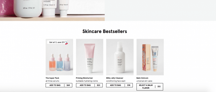 Note here how Glossier moves from a banner image to uncluttered product images with minimal descriptions offset by a simple text header and the “Add to Bag” CTA along the bottom of each item. Without having to navigate, customers can easily identify an item by sight and throw it in their cart to quickly shop the items they want by header (Skincare Bestsellers or Makeup Bestsellers) on the home page.
Routine features
We’ve already been over the prevalence of top bar menus, so it’s no surprise that customers will generally scan a number of conventional places to find routine features. Those who are task scanning for additional information about a site, a particular section, or a contact page are on the lookout for these menus.
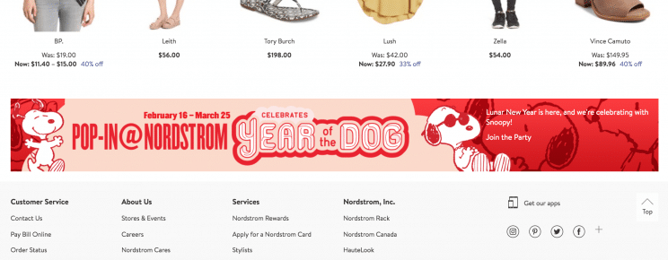
Aside from the topbar, there are bottom links, usually to FAQs, Help, and About the company. Here, Nordstrom shows a pretty standard bottom bar menu, but offsets it with a visual announcement:
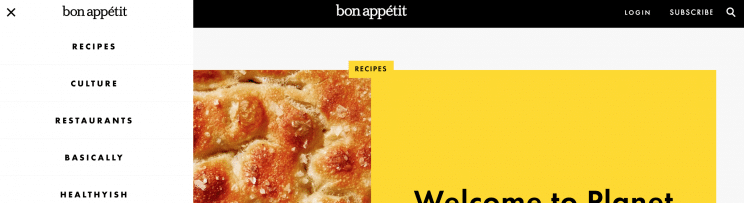
There are also side menus. Here, you can see Bon Appétit uses their pop-up side menu to segment out their website so that people who come for recipes know where to go and people that come for something else aren’t inundated with a flood of meal ideas:
Although we railed against using z- and f- patterns for design, even though they are common ways that people are scanning the web, we would recommend using classic features like easily accessible search, sidebars, and bottom information. The design and layout of your items are something that you should experiment with, but when it comes to finding more routine stuff, people want to know where to make major navigational moves. These classic features aren’t the place to break out bold new designs.
Design the websites your customers want
Scanning patterns and tricks to hold viewers’ attention aren’t junk science. People do actually interact with websites in reasonably predictable patterns. But instead of designing the website customers are used to viewing, design the website they want. Use design, images, headers, CTAs and layout to make your website fit for the types of task scanners you get.
For e-commerce, this means clear category menus, more images and strategic offsetting. Instead of focusing on buzz surrounding eye movements, work your way backward from what your customers need. Where do they visit most often? What is their navigation path through your site? Are you answering their major questions within a few obvious clicks? If you take this approach, it won’t matter Z, F, Q, M, S, or V-shaped — customers will get what they need.