In the traditional eCommerce journey, your product listing pages are the gateway to checkout. They’re the bridge — or the digital moving walkway — that shuttle shoppers down the funnel until they buy.
Just think about it — any time someone engages with your menu, they’re going to land on a product listing page. These pages are like the heart of your website navigation experience.
While a lot of attention is given to product detail pages and to your homepage (rightly so!), product listing or category pages need the same level of thought and strategy in order to optimize conversion on your website.
A quick note before we get started:
As with any changes that impact the customer experience on your site, there is no one-size-fits-all solution for product listing page design.
In other words, a best practice for a jewelry site may not work for a home goods seller, and what works for furniture stores may not resonate with low-cost fashion shoppers. While many other blogs out there will preach one universal list of best practices, the best advice I can offer is to read all of this with your specific customers in mind.
When deciding how to optimize your product listing page, you must always consider Is this change going to benefit my target audience? What tips will cohere with my shoppers’ behaviors and preferences, and what won’t? Will this feature nudge a visitor to move down the funnel, or will it drive them away?
Okay, now we can dive in.
Page Layout & Speed
Create fast-loading pages and layouts that align with your product offering.
- Ensure product listing pages load in two seconds or less. Whether your shoppers clicked on your menu or reached a PLP through a Google search, if it takes too long to load, you’ve introduced a major hurdle that can stop the shopping journey in its tracks. According to Neil Patel, 47% of shoppers expect a web page to load in two seconds or less, while 40% will abandon a site that takes more than three seconds to load.
- Include two to four images per row in grid view. If you want to create a grid view aesthetic (as opposed to a list view with one product per line, which is more common in certain verticals like electronics), then don’t exceed four items per row.
If you display more than four images per row, each item will need to be very small, which can be frustrating for shoppers who want to get a good look before clicking. When deciding how many items to include in each row, consider the size of your images, how many products will appear on the page, and how much information will be included with each product.
- Go “load more” scrolling or pagination over infinite scroll. While you want shoppers to see as many items as possible, infinite scroll can be overwhelming and may impede decision-making. With the option to load more for a new set of products, shoppers are forced to pause and consider their options. Additionally, for higher ticket items that require research or comparison shopping, pagination is a good way to give customers a reference point so they can revisit their top options easily.
- Include a compelling banner and SEO-friendly header text. Placing a banner on top of your PLP can be a great way to draw attention to any ongoing promotions, such as in boohoo’s “Cyber Monday” banner below. However it shouldn’t interrupt the shopper’s flow or distract them from what they are looking for. The “Cyber Monday” banner is not actually clickable and doesn’t lead shoppers to a new page, rather, it is there to inform them of the sale.
To the left of the banner, you’ll see a paragraph of text that includes many relevant search terms that could draw organic search engine visitors to the page (i.e., “teddy coats,” “parkas” “faux fur,” “bubble winter jacket”). In this box of text, the product categories are clickable because they help a shopper refine their search and find the most relevant products within the PLP.
Product Images
Include high-quality, large, and dynamic images that provide an authentic view of the item.
- Use high-quality images that adequately display the product. Choosing good images for your PLP is crucial. According to Field Agent, 83% of smartphone users in the US said product images are “very” and “extremely” influential to their purchasing decision. So what does “high-quality” images mean, exactly? You want a photo that provides an accurate and detailed view of the product so a shopper who can’t inspect it in person is inspired and informed enough to purchase it. For clothes, this usually means showing them on a model. For jewelry, close-up views are preferred. For furniture, seeing what a couch or desk looks like in an actual room can be the most inspiring.
- Provide additional views on hover. Help customers better understand how products look before entering the product detail page. When a visitor’s mouse hovers over a product image, display a new view of the product. In the example below of Shane Co.’s wedding bands, the image shifts to one featuring the ring on a woman’s hand, so a shopper can see how it looks both up close, as well as on a real person. It also provides more detailed product information on hover, such as the type of metal and total carat weight.
Regular view:
View on hover:
- Standardize images to create a harmonious, aesthetic look on your online store. This isn’t always necessary or possible, but when it works, it works. Standardizing your images — so they include the same angles, background colors, and displays (i.e. on a model or not), can foster a pleasant aesthetic for your site and make it easier to cultivate a strong brand image. It also makes it easier to sift through products without having to process different backgrounds or other distracting elements.
Below, the ASOS models are shot against a pale grey background, which makes each dress easy to see.
Product Descriptions
Let your customer audience be your guide.
- Always include the price and product title. The information you put on the PLP should be just enough to draw a shopper down the funnel into the product detail page. Determining the “right” information depends on who your shoppers are and what they care about when deciding to make a purchase. It’s safe to say that the title of the product and price should always be included. Beyond that, your target audience should determine what additional information to include.
- Include information “extras” that will nudge shoppers to buy. Beyond titles and price, other information can serve as significant motivators for different types of shoppers. You may consider adding some of the following — pick and choose based on what works with your audience. :
- A wishlist button
- Colors and size options
- Discounts
- Stock availability
- Best sellers
- Add-to-cart
- Star ratings
Some shoppers may be more easily swayed by social proof, such as banners that indicate “best sellers,” “low in stock,” or star ratings. This could be effective among shoppers who are seeking quality verification from other consumers, such as for low-cost fashion, skincare, or electronics. , However, it would be less effective for shoppers of luxury items, such as designer bags or artwork. For example, it wouldn’t work for jewelry sites, where shoppers care more about finding unique pieces. In this case, banners that say “new collection” or “premium” collection would be more enticing than “best seller.”
In the example below, fashion site Dynamite provides information on colors and sizes when a shopper hovers their mouse over a product. This is a great approach because it tells a shopper what they will want to know without taking up too much real estate on the PLP.
Sales & Savings
Get creative to highlight sales and upsell your customers.
- Highlight price reductions. There’s a lot of psychology behind pricing and consumer behavior. I won’t go in-depth here, but I will recommend making price reductions very obvious by highlighting them. In the example below, SHEIN crosses out the original price and lists the new price in a larger, bold, red font.
Again, these tactics will work for some audiences, but not others. For example, shoppers of fine jewelry or high-end fashion would probably be wary of buying something if its price was reduced by 90%.
- Encourage upselling with cost-saving bundles. Why buy one product when you could buy three for the cost of two? If you sell bundled items, you can upsell your customers by getting them to think this way.
In the example below, Asos offers bundled basics at a better price. This is a great way to increase shoppers’ average order value while helping them achieve cost savings on more products.
Personalization
Use technology to personalize PLPs to shoppers’ tastes and objectives
- Use recommendation carousels to highlight relevant products. Adding personalized recommendations to the top of the PLP can help draw a shopper’s attention to the items they’ll love the most. With tools like visual AI, your personalization engine will gain a much deeper, human-like understanding of what each individual shopper’s tastes and preferences are based on the visual attributes of the items they interact with. With these insights, you can draw shoppers’ attention to the items they are sure to love, thereby shortening the time spent scrolling through the PLP and smoothing out the shopping journey.
- Display the results that best fit shoppers’ individual styles at the top of the PLP. Imagine a shopper searches for “boots” in your search bar. This query could yield a wide range of search results, as your inventory contains hundreds of different pairs of boots. But to effectively shuttle your shopper down the funnel, you want to display the boots that best match her style and intentions at the top of your PLP. When you enhance your merchandising strategy with smart rules and a hyper-personalization engine, you can automatically prioritize the items your shoppers are most likely to buy on any category page.
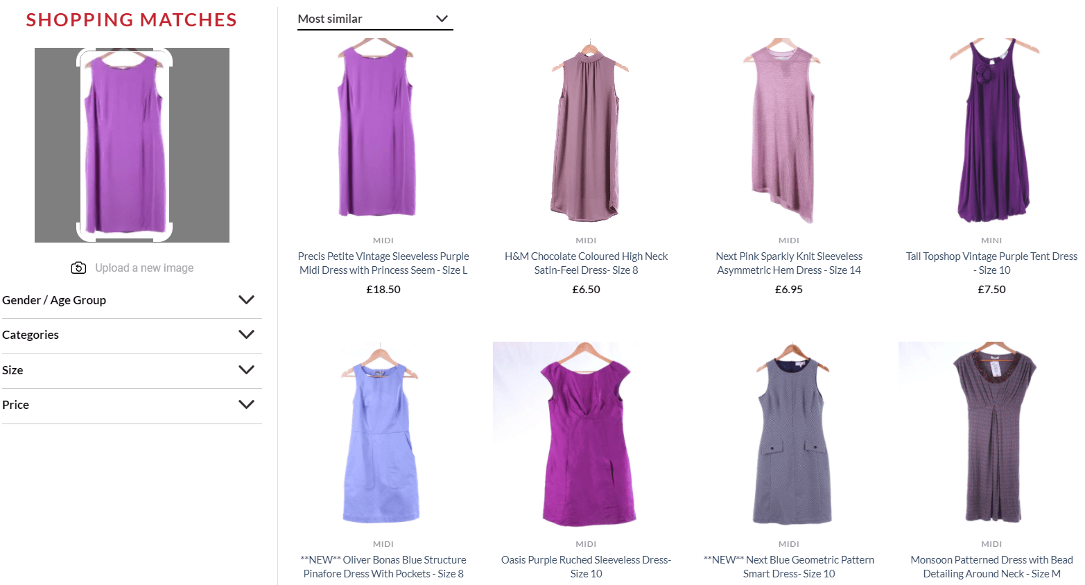
- Empower shoppers to see similar results to the items they love. A highly effective way to create personalized shopping journeys via the PLP is by allowing shoppers to indicate which items on the page are the most relevant and see other closely related products. By adding a Discovery Button to your product images, shoppers can simply click to get to a curated PLP. Instead of sifting through all of the “desk chair” results in the example from White Rose charity shop below, I have the opportunity to narrow in on sleeveless purple dresses, since that’s the look I am going for.
- Offer one-on-one assistance. You can bring in-store levels of personalized attention to the online experience by allowing shoppers to chat or WhatsApp with an expert. This is especially relevant for considered purchases, like fine jewelry or furniture. In the example below, Shane Co inserts an option to book an online appointment with a jewelry consultant in between item images on the PLP.
Filters & Sorting
Make it as easy as possible for shoppers to view relevant results
- Offer filters to help shoppers narrow down search results. Filters allow shoppers to effectively “weed out” the items that aren’t relevant to their tastes, budgets, and intentions, which makes it easier to locate the products they would actually buy. Below, as I search for mirrors on Castorama, I can use filters to narrow down to mirrors that are rectangular and available for home delivery. I also have the option to filter by material, width, height, color, customer rating, and price.
- Allow shoppers to sort results according to their intentions. Another way to make the PLP more “legible” to shoppers is to allow them to sort the results according to one important criterion. Shoppers that are looking for inexpensive items on the PLP would probably appreciate the option to sort results by lowest to highest price, while frequent browsers would favor sorting by newest items or most popular.
Calls to Action
Use CTAs that are highly tailored to your target customers.
- Use “quick add” buttons with discretion. Allowing shoppers to instantly add an item they love to their cart straight from the PLP can help increase conversion and average order value, but it won’t work for all shoppers or products. For example, shoppers buying expensive items — such as furniture, antiques, jewelry, or electronics — will not hastily add items to their carts without reading the granular details that are only accessible on the PDP.
In the example from Shein below, the option to “Add to Bag” pops up when you hover your cursor over an item on the PLP. This is a great approach, because it allows you to offer this function without cluttering up the images with another button.
- If you offer a wishlist or the option to “favorite” items, consider what purpose this function serves. Wishlists and the option to save items as a favorite have pros and cons. On one hand, they help shoppers remember and revisit the products they liked. On the other hand, offering these options often reduces the sense of urgency a shopper might otherwise feel to make a purchase. If you decide to offer a wishlist or the option to save an item as a favorite, make sure it serves a larger strategic goal. For example, you can use it for retargeting and personalized email marketing to remind them of the products they left behind. If you aren’t bringing shoppers back to their wishlists, they aren’t adding value to your business.
- Be consistent with your CTAs. If you decide that offering a “Quick Add” or “Wishlist” CTA is important for your PLP strategy, it’s best to be consistent across your entire website. If shoppers have the chance to add certain items directly to their carts, but not others, it could cause both confusion and frustration.